SaaS · Product design · Web design
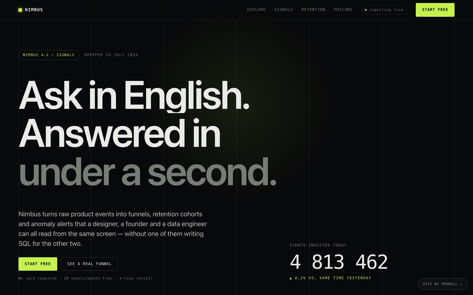
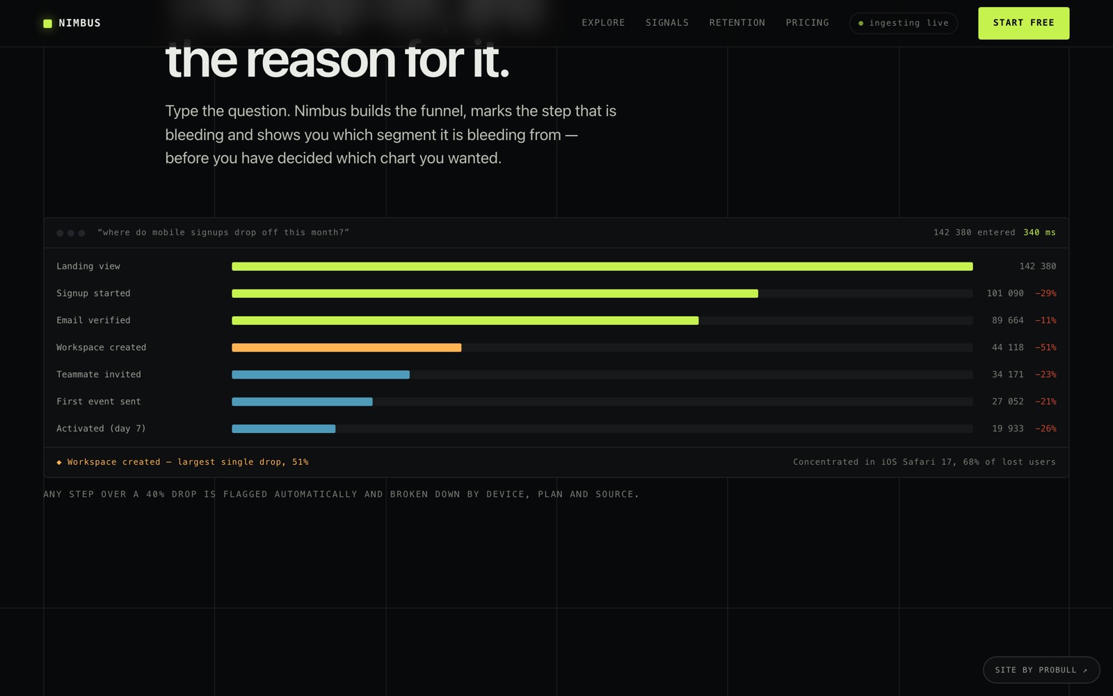
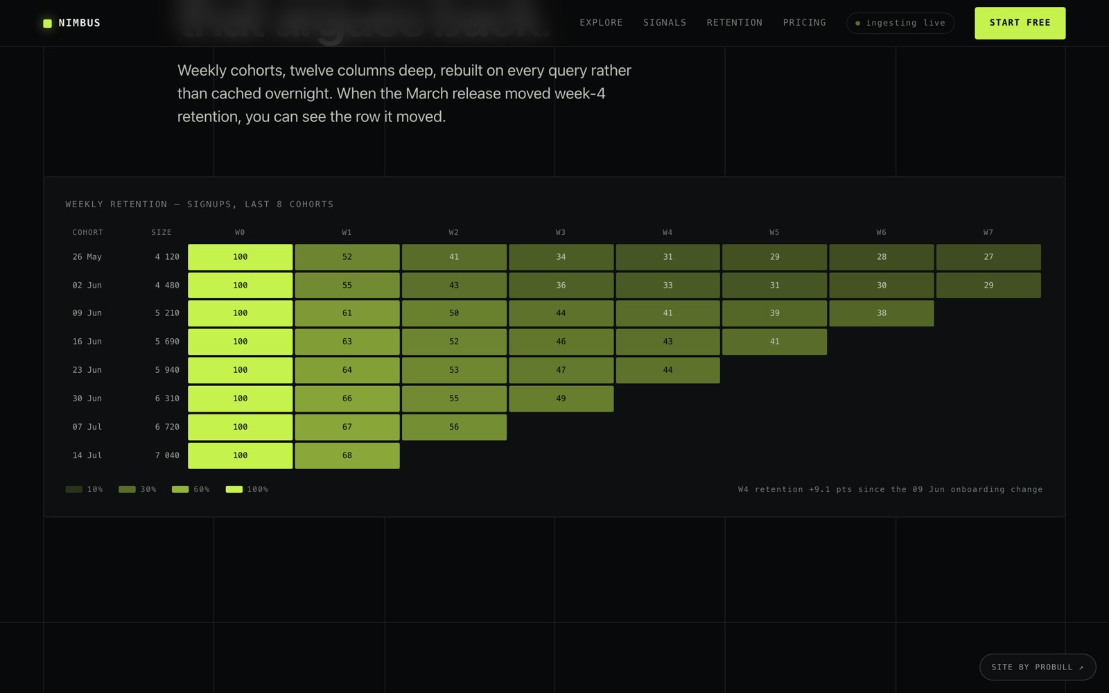
A product-analytics platform given a Swiss, terminal-grade interface: a hairline column grid, monospaced data, one acid accent and two working data pieces — an animated funnel waterfall and an eight-week retention cohort table — built entirely in HTML, CSS and SVG.
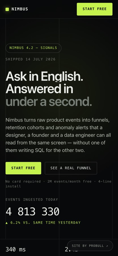
Designed to stay sharp on a phone: the whole layout is responsive down to 390px, hand-built with no framework.
Make an analytics product look like it respects data. No hero illustration, no gradient blobs — a page whose typography and grid behave like the tool itself.
A single self-contained page: a cursor-lit hero with a live ingest ticker, an animated funnel waterfall that flags its own worst drop-off, four capability entries, a syntax-highlighted install snippet, a retention heatmap generated in the browser, a metric band, quotes, table-style pricing rows and an FAQ.
Analytics buyers trust tools that look like tools. A pretty hero with a stock photo would undersell it.
We built a working-looking dashboard in SVG — a chart and bars that animate on load — so the hero shows the product, not a mood.The page sells capability, not vibes.
Most sites like this ship a megabyte of React to draw a landing page.
Hand-written HTML, CSS and vanilla JS, everything inline. Glass cards and gradient mesh done in pure CSS.One file, no build step, near-instant load.
Dev audiences bounce off noisy animation.
Subtle scroll-reveals and count-ups, all gated behind prefers-reduced-motion.Alive on first load, calm on scroll, static if you ask it to be.