E-commerce · Brand · Web design
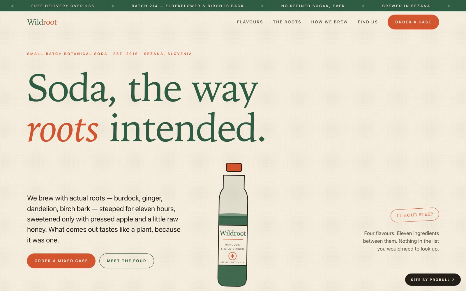
A botanical soda brand built as a risograph-style editorial: cream paper, a two-colour overprint palette, and a page that takes its colour from whichever flavour you touch. Every bottle is drawn in SVG, down to the carbonation.
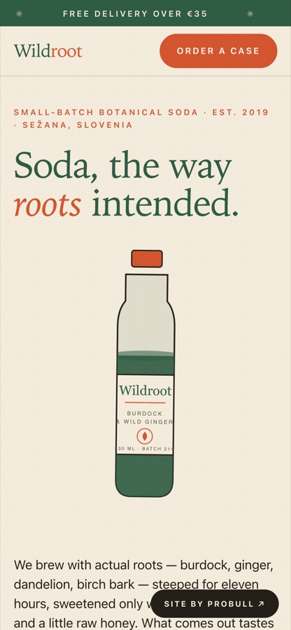
Designed to stay sharp on a phone: the whole layout is responsive down to 390px, hand-built with no framework.
Sell a drink whose whole argument is that it is made of real plants — without a single stock photograph.
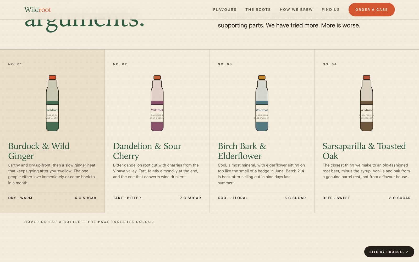
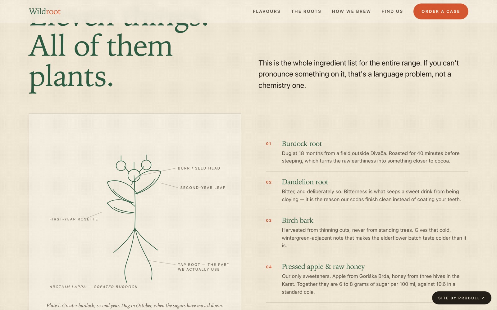
A self-contained storefront: an SVG bottle with rising bubbles, four flavours that re-theme the entire page on hover, a hand-drawn botanical plate that inks itself in on scroll, a four-step brewing process, an honest nutrition comparison table, stockists, a subscription box and an FAQ.
Product photography is the obvious crutch, and the fastest way to look like every other Shopify store.
We drew each flavor as an SVG bottle in its own colour, with a label band and cap.A grid that looks bespoke, loads instantly, and never needs a photoshoot.
Craft brands live or die on feeling hand-made.
A cream palette, a serif display face and organic shapes, with roots and leaves as decorative SVG.Reads like a real small-batch label, not a template.
Static drinks sites feel flat.
Bubbles drift up the hero and bottles lift on hover — all disabled under reduced-motion.Playful where it counts, calm everywhere else.