Brand · Design · E-commerce
An Italian wellness brand reborn: new name on the door, new identity, new store, and a domain migration that kept every ranking it had.
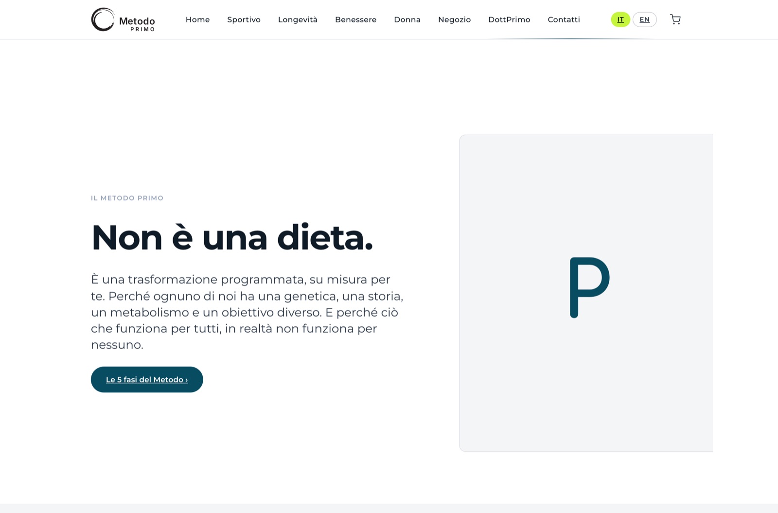
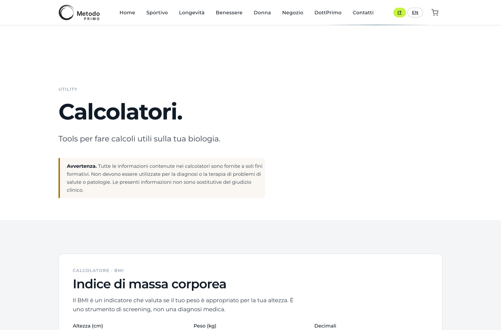
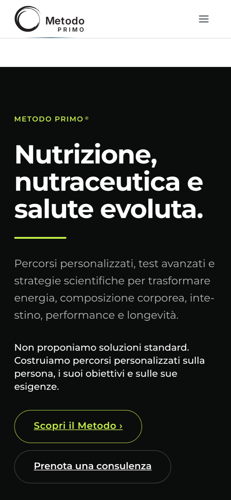
A wellness brand has to feel unhurried. Generous spacing, one idea per screen and a palette that stays soft: the mobile site reads like the brand sounds.
The brand had outgrown its old name and site. It needed a new identity and a new home at a new domain, without losing customers, search traffic or the mail pipeline along the way.
We designed the new Metodo Primo identity, an enso-inspired logo and a calm, premium visual language, then rebuilt the WooCommerce store around it and moved the whole site to the new domain with full 301 continuity. Copy, favicon, storefront: every touchpoint rebranded.
The brand had grown past its old name and its old look. Nothing on the site said what it had become.
We designed the Metodo Primo identity from scratch: an enso-inspired mark, a calm premium palette and typography, and copy rewritten to match.One brand, consistent everywhere.
Moving to a new domain meant risking every position in search, plus the mail addresses the business runs on.
A complete 301 map, Cloudflare in front, canonicals and hreflang rewritten, and the mail pipeline moved before the switch, not after.Migrated with rankings and mail intact.
The method was the product, but the site sold before it explained. People left without understanding the offer.
We restructured the content into method, protocol and calculator pages that explain the approach first and sell second.Visitors arrive informed.
A premium identity on the pages, a default WooCommerce theme in the shop.
The storefront was rebuilt around the new identity: product pages, cart and checkout all in the same visual language.One shop, one brand.