Wellness · Brand · Web design
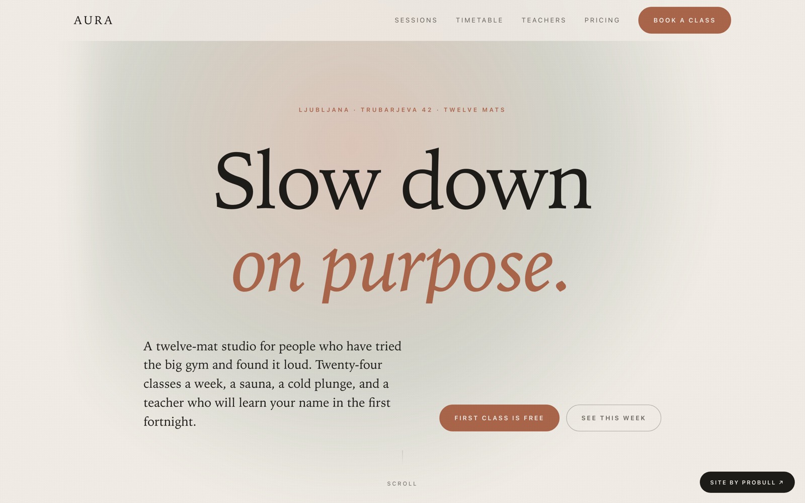
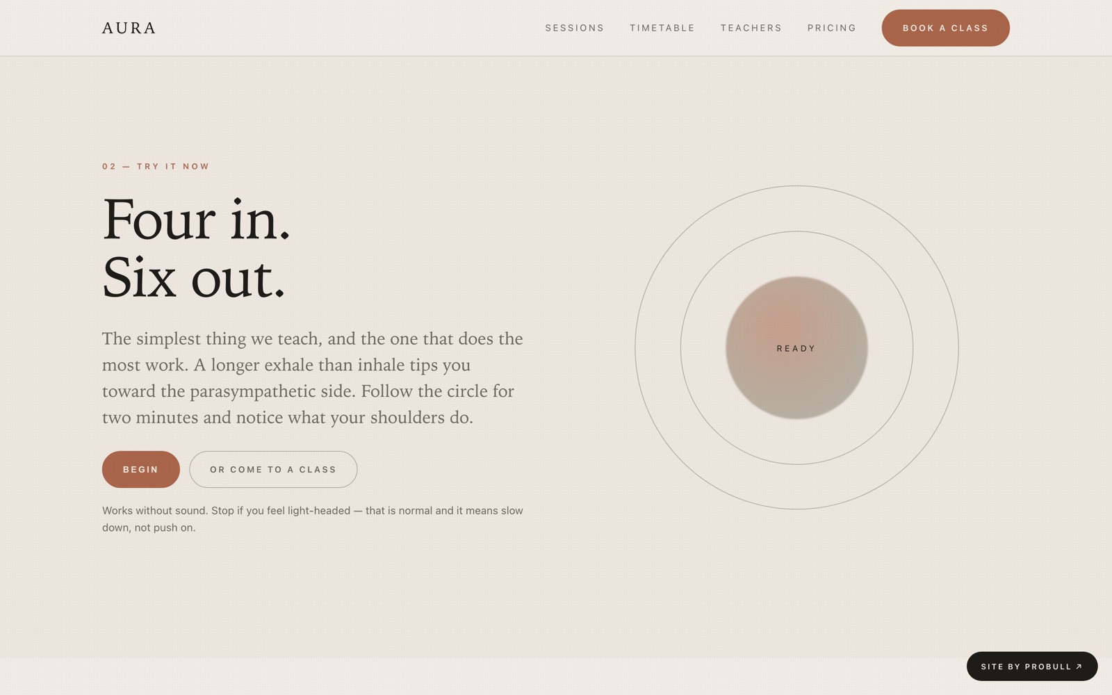
A twelve-mat yoga and recovery studio given a quiet, editorial page: large light serif, a slowly breathing gradient field, and an interactive four-in six-out breath pacer you can actually use before you decide to book.
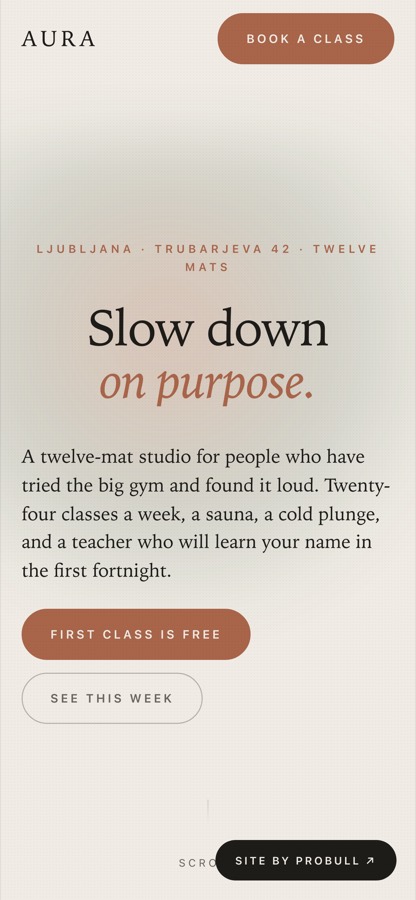
Designed to stay sharp on a phone: the whole layout is responsive down to 390px, hand-built with no framework.
Feel like the room. Wellness sites usually shout with bright CTAs and fast carousels, which breaks the promise before anyone has read a word.
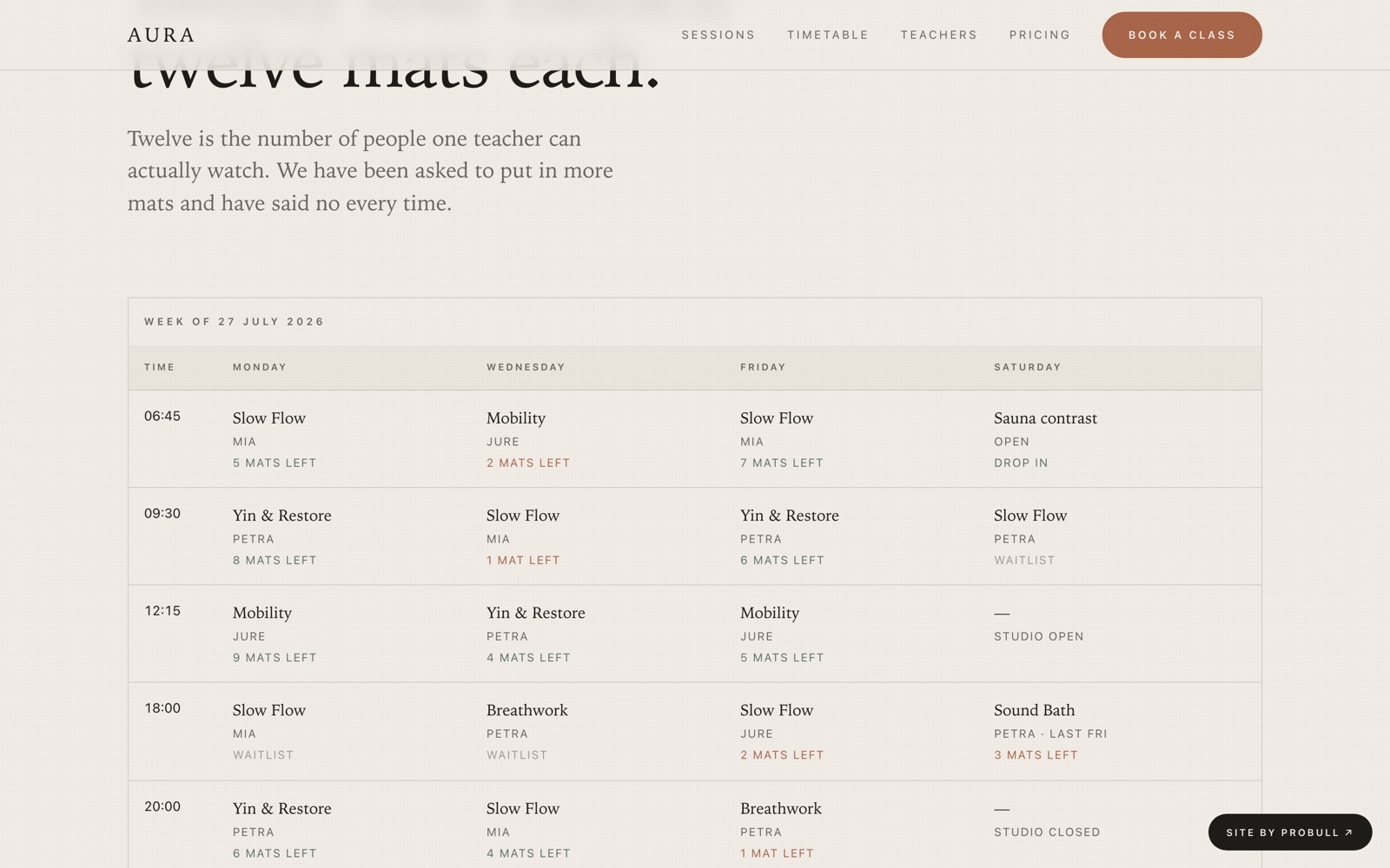
A self-contained page: a full-height breathing hero, six session formats as a hairline list, a working breath pacer with a countdown, a real weekly timetable with live mat counts, three teachers, an SVG floor plan of the studio, three pricing options, member quotes and an FAQ.
Wellness sites often shout — bright CTAs, fast carousels — which breaks the promise.
Generous whitespace, a serif-led hierarchy, and motion timed to a breath cycle.The page feels like the service it sells.
Stock yoga photos are a cliché and rarely on-brand.
A sand-and-sage palette and abstract SVG shapes carry the mood instead.On-brand from the first frame, nothing to license.
Even reveals can feel aggressive if mistimed.
Soft fade-and-rise reveals, long easing, full reduced-motion fallback.Serene on every device and setting.